Departure
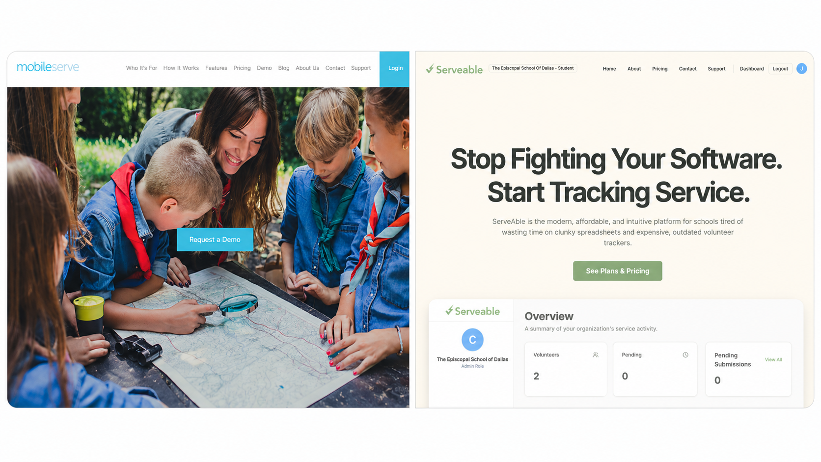
Every NHS kid gets pushed into MobileServe, and nobody likes it — a cluttered legacy dashboard with side-nav pie charts and line graphs piled on top of each other, fronted by a marketing site whose hero is a teacher kneeling over a paper map next to a bright blue Request a Demo button. The work admins actually do is one verb (approve or reject). The work students actually do is one number (how many approved hours, how far from the NHS goal). Serveable was the kinder rebuild — student portal, admin portal, hour logs, approvals, charts, PDF exports, Supabase auth — sketched in a notebook before any code touched the editor.
Approach
- Next.js
- Supabase
- Vercel
- Cloudflare R2
- DreamHost
Two portals — student and admin — sharing one Supabase schema, one auth flow, and one set of approval rules. No second app to keep in sync.
Field log
Opened a notebook and drew the whole thing on graph paper before touching the editor. Big approved-hours number for the student. KPI cards for the admin. The sketch was the spec.
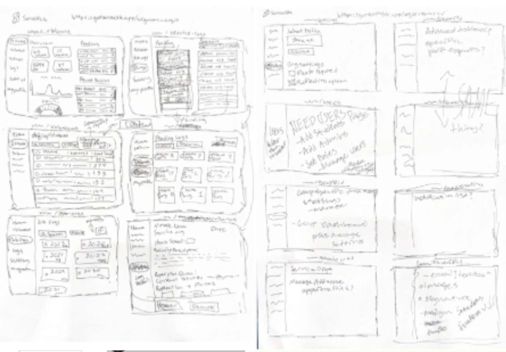
The spec, in pen. Pulled up the incumbent for reference. The dashboard was a blur of side navigation, KPI boxes, donut charts, monthly bar charts, map widgets, and reports. Useful data was in there somewhere, but the interface made every answer feel far away.
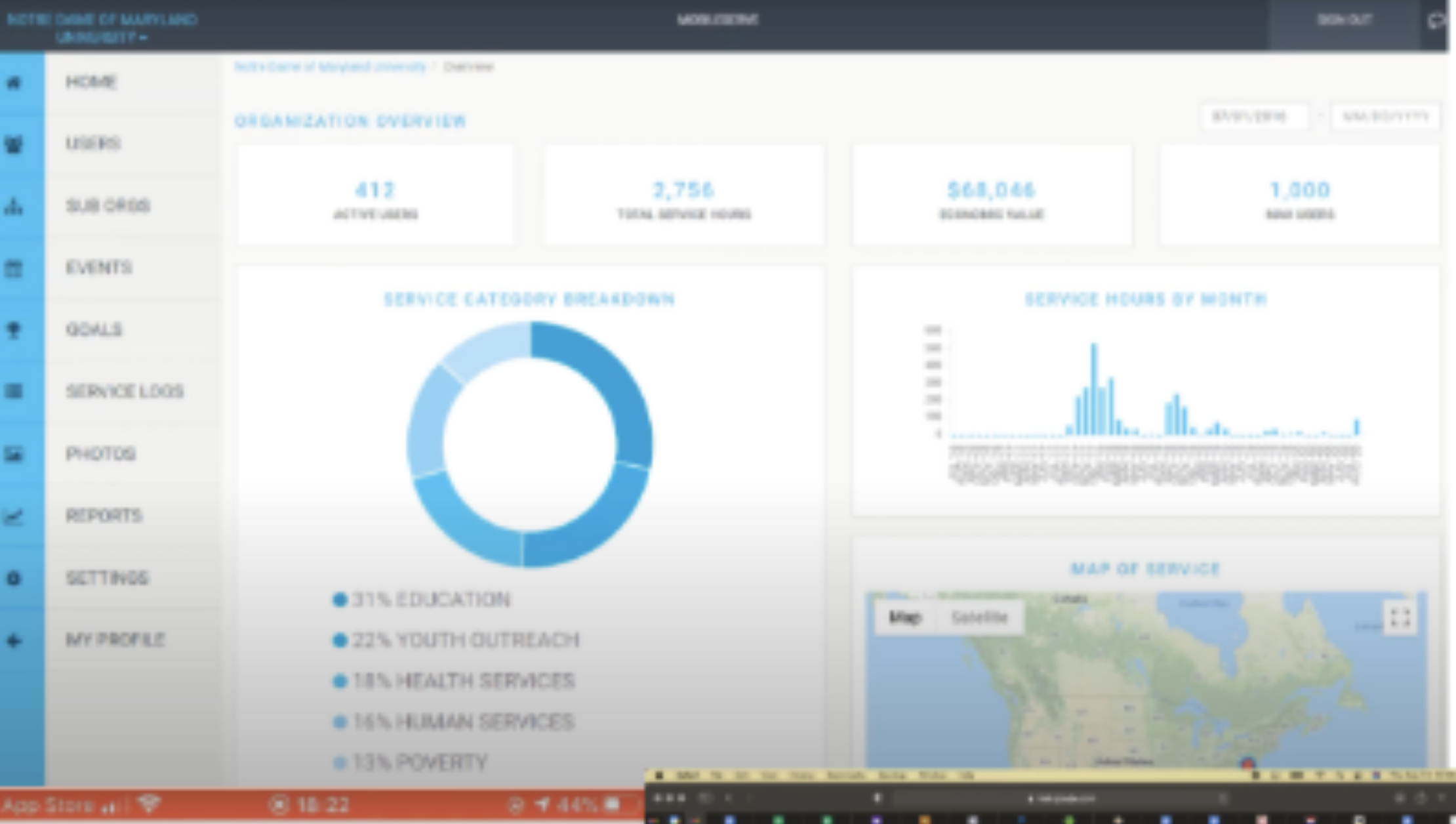
MobileServe dashboard — the thing to beat. Next.js on Vercel for the app, Supabase for auth and Postgres, Cloudflare R2 for hour-log photo proof, DreamHost holding the domain from a previous life. Boring stack on purpose — the interesting part was the UI.

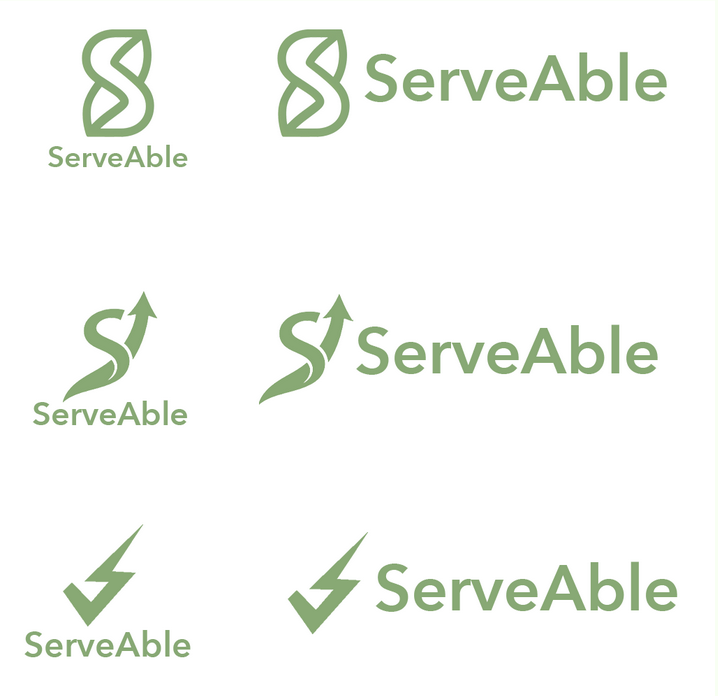
Five logos, one boring stack. Ran a continuous-line 'S' through six iterations, basic loops to a single green stroke forming an 'S' inside a leaf. Wordmark settled on ServeAble. Service plus growth, in one stroke.
Six drafts to the leaf-S. Mockup landed. "Stop Fighting Your Software. Start Tracking Service." on a clean minimalist beige background. Three pillars underneath: Effortless Efficiency, Unbeatable Value, The Personal Touch. The opposite of a stock-photo paper map.
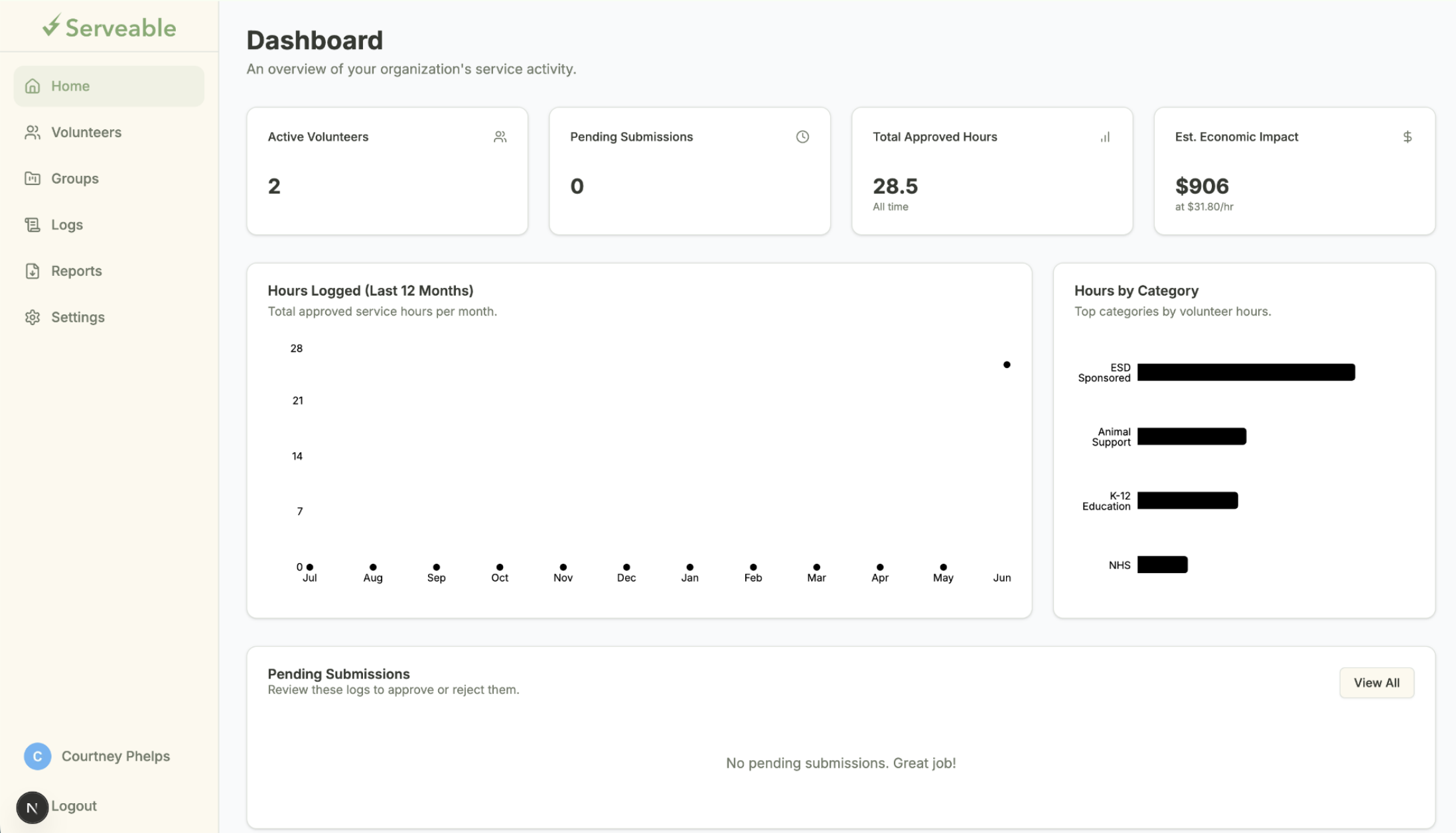
Four KPI cards across the top — Active Volunteers, Pending Submissions, Total Approved Hours, Est. Economic Impact — with charts and the approval queue underneath. The whole admin job is a queue. The dashboard tells you how big it is.
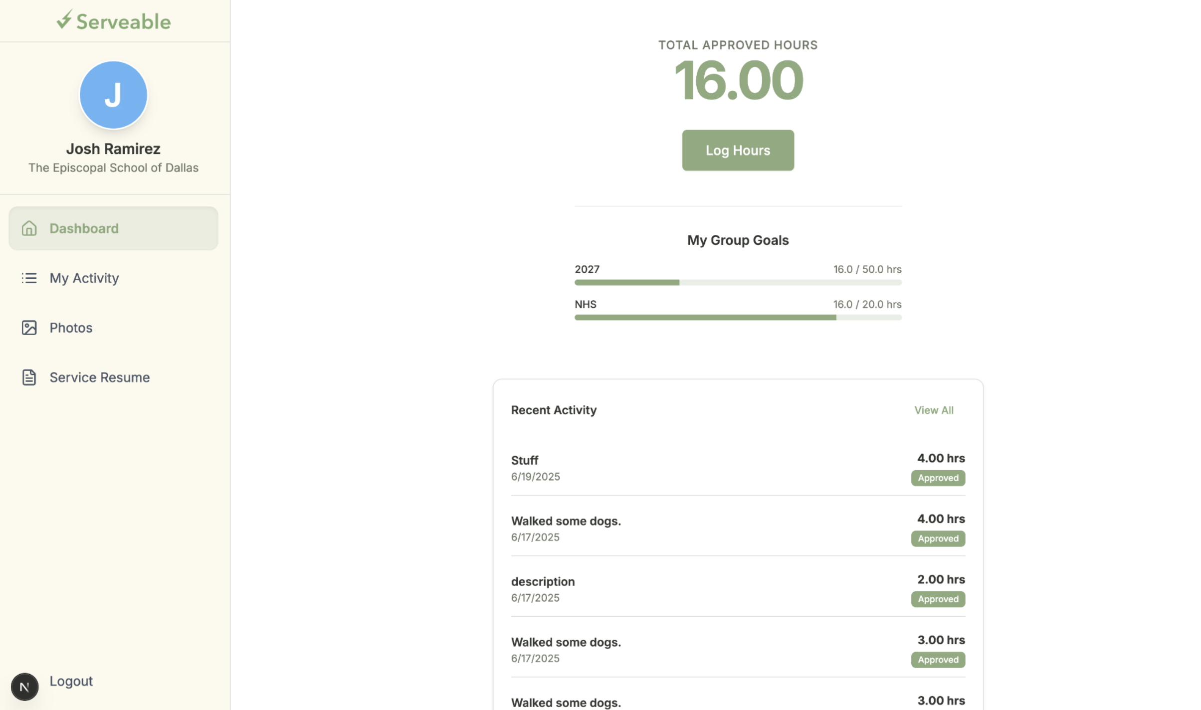
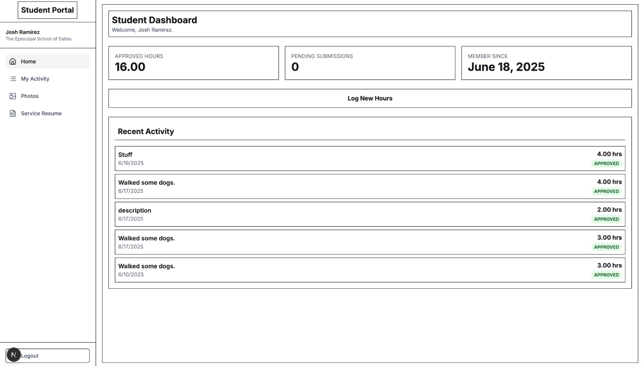
Admin dashboard: the queue, the totals, and the shape of the hours. Student dashboard came together around a massive green 16.00 — Total Approved Hours — with progress bars for My Group Goals (NHS) right under it. Recent Activity down the side reading "Walked some dogs." Everything else on the page was deliberately small.
16.00. The student's whole product. Detailed admin view added: a scatter-line graph for Hours Logged (Last 12 Months) and horizontal bar charts for Hours by Category — Sponsored, Animal Support, Education. The KPIs answer how much. The charts answer where it came from.
From the gallery
What I came back with
Lesson from the terrain
Replacing incumbent school software is mostly a subtraction problem — MobileServe wasn't missing features, it was drowning in them, and the kinder version is the one that surfaces a single number to a student and a single verb to an admin. Six logo drafts to land on a leaf-shaped 'S' felt like overkill until I noticed I was iterating on the same thing the dashboards were iterating on: how little can sit on the page and still mean what it needs to mean.