Departure
Open House Day is a logistics problem disguised as a welcome event. Visiting families come up the chapel walk holding a phone and need one answer: where am I supposed to be now? I built an iOS guide around that question: a home screen with the current event, a schedule, and a campus guide that could turn the next stop into navigation.
Approach
- React Native
- Expo
- Supabase
- Gemini
- Antigravity
One real test window: the actual open house. The app had to be rehearsable with a fake clock, readable while walking, and useful before anyone understood the campus.
Field log
The first build was deliberately plain. The Home tab opened with 'Welcome to ESD Open House,' a single Up Next card, and a short itinerary underneath. The important part was already there: if a parent looked down for three seconds, they could see the current event, time, place, and Guide Me There button.
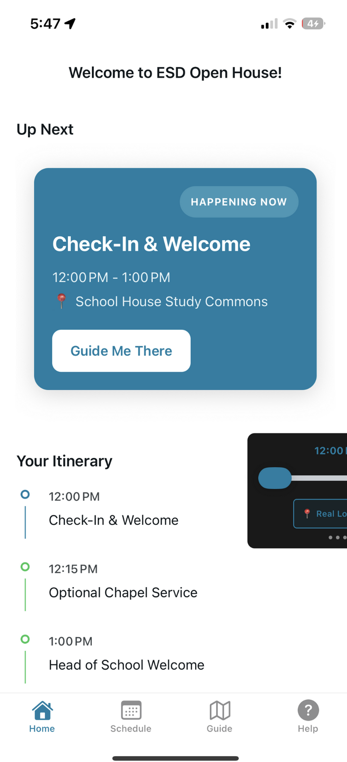
First cut. Plain, but the core product was visible: what is happening now? The schedule mattered. The map mattered. But on the actual walk up, the now-card was the app. Event software collapses to the thing happening next; everything else is reassurance for the person already moving.
I used Antigravity to rebase the event dates so the app could be tested before the real Sunday. It handled the schedule swap cleanly, then got tangled when I asked it to fix the fake-time harness too. The screenshot tells the whole day: schedule.ts updated, TimeProvider and DevTimeSlider half-edited, Expo running, Android SDK warnings, and the agent terminating before the time-machine path was actually clean.
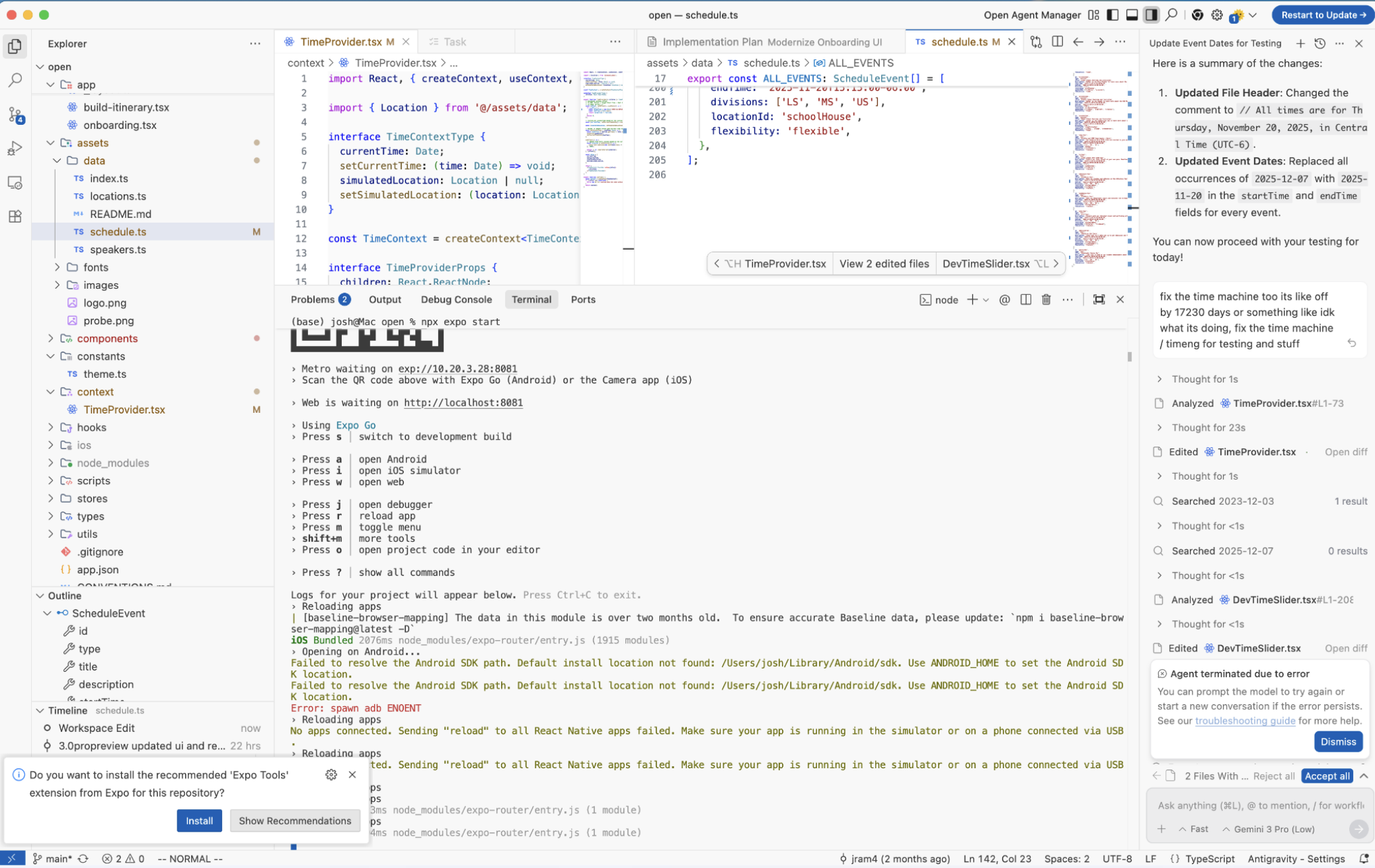
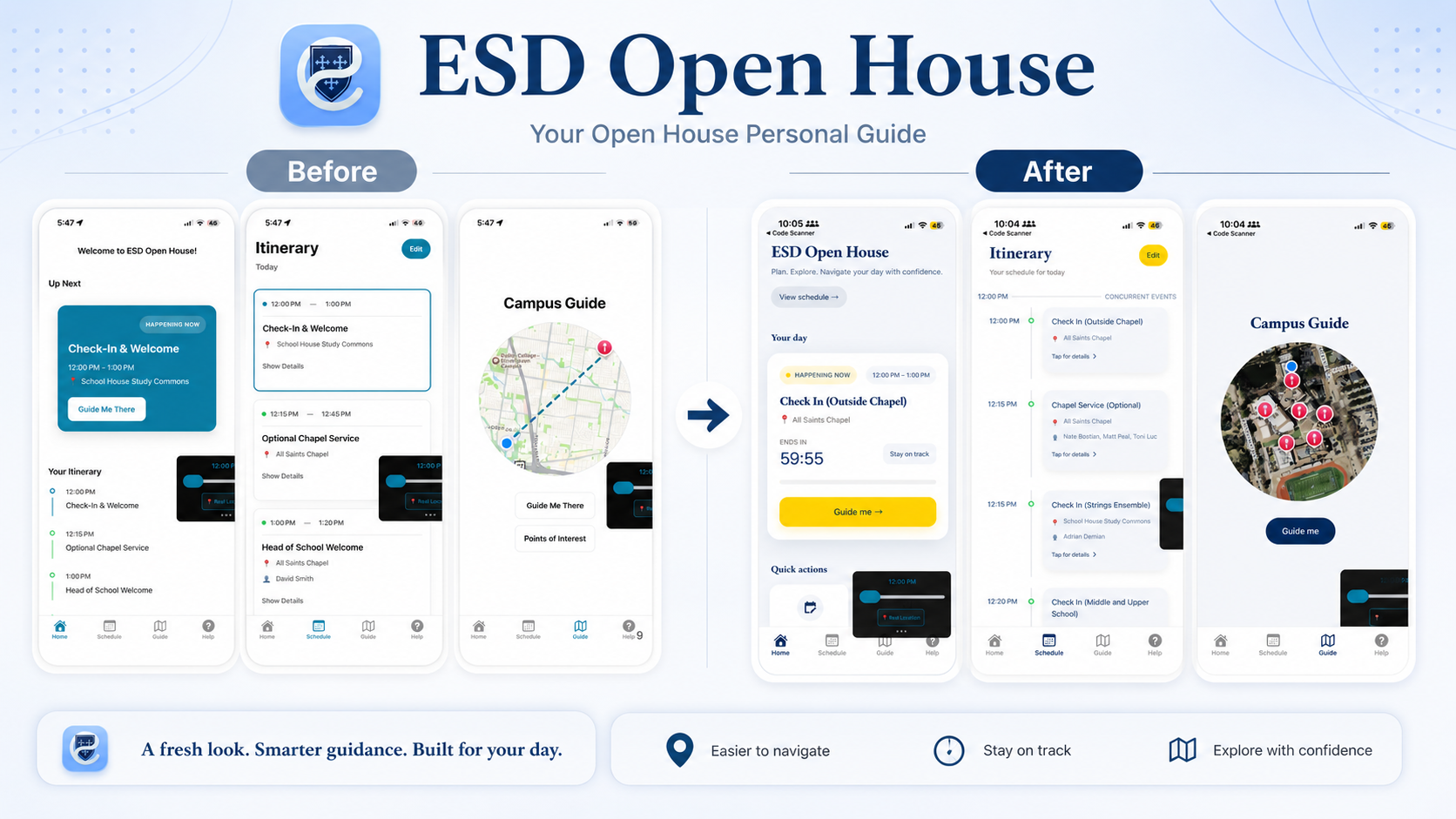
Antigravity was good at the broad date swap and brittle inside the fake-clock chain. The redesign made the same product feel more like ESD. The blue serif headings, lighter cards, yellow status pill, bigger navigation button, and circular campus map all pushed the app away from utility prototype and toward open-house guide.
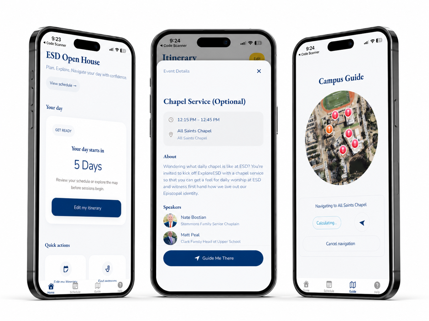
The final mockup: home, event details, and guided campus navigation. The map view became the clearest visual upgrade. A circular satellite cutout kept the campus recognizable, red pins marked destinations, the blue dot marked the visitor, and the button copy stayed simple: Guide me.
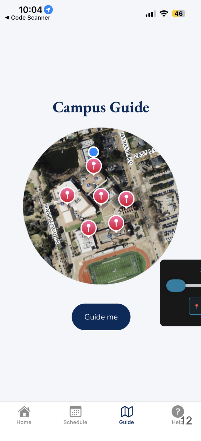
Campus Guide, redesigned: fewer controls, clearer next action.
From the gallery
What I came back with
Lesson from the terrain
The open-house app worked because it respected the moment: families did not need a portal, they needed a next step. The first cut found the center of gravity with the now-card; the Gemini pass made that same idea feel designed; Antigravity helped with broad repo edits but still struggled when the change required understanding time, simulation, and Expo all at once. The product lesson was simple: make the current event impossible to miss, then make the next location one tap away.